Sorry about the hiatus, students. I was finding it a bit hard to break down my process (since so much of it has begun to become simply intuitive to me at this point), but I think I've finally got something.
Be warned, this lesson is a bit long-winded.
And so, without further ado, I present:
Lesson 4: Outlining a Person (AKA Ron Weasley: Part 1)
For this lesson, I'm going to show you a basic run-down of how to outline a person. A few of the pointers I give here might also be carried across to outlining lots of non-human creatures, so pay attention!
I tried to pick a recognizeable person to demonstrate my technique on. It was originally going to be Harry Potter, but he turned out looking more like Ron, so I decided that Ron doesn't get enough fan-art done for him anyway, so now it's Ron.
Anyway, let's get started on Ron!
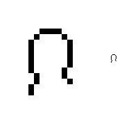
First off, we make an outline of a bald head. Round off the top by using 1-pixel lines on each top corner, like so.
[spoiler]
[/spoiler]
The face should just be a flat surface when working at this scale. Trust me, anything you do to that outline (even if it's only one pixel) will seem to stick out too much, and will probably look silly. There are a few, very few, cases when you need to have something sticking out, but most of the time, a flat line will do.
The neck should be an indentation of about two pixels in length (for a more burly person, you might use just one pixel), and it should actually be lower in the front than at the back (by a difference of about 1 pixel).
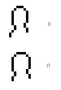
Feel free to play with different head shapes and sizes, as well as different shapes of the shoulders (changing the size of something you've already drawn, without backtracking, is a process that will be covered in more detail shortly).
[spoiler]
[/spoiler]
Adding another pixel forward from the front of the shoulder tends to make it look like the chest is sticking out (as seen in the top picture shown above).
Anyway, I think I like the first head-shape I had, so we'll go back to that one.
An eye at this scale is only one pixel in size, touching the front line of the face, and about midway down the face (if your face is an even-number of pixels, however, then the eye should be just above the midline).
[spoiler]
[/spoiler]
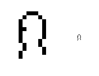
Next, we draw the chest. Continue the lines of the shoulders and back straight down, with an inward break on the front side to hint at the bottom edge of the rib-cage.
[spoiler]
[/spoiler]
It's important to remember the basic shape of the rib-cage, no matter what kind of creature you're drawing. You don't usually need to off-set your line by more than a pixel to show that the rib-cage is there, but it's still important to remember that it
is there.
Also, remember to modify this basic design for if your guy is leaning slightly backwards or forwards, or if he has a different build than I've shown here. For example, you might want to have a rib-cage that is more prominant (like if you're drawing a burly guy) or less prominant (like in the case of a fat guy, whose rib-cage might be more obscured).
Of course, you also have to keep in mind a bit of basic anatomy that can be found in the general rib-cage area if your subject is female . . . but I don't think I need to explain how to draw that. Just remember the lesson about curves.

One last note about the torso. When your subject is leaning, just keep in mind the principle of angles being represented by numbers that you learned in the first lesson, and you should be fine. In other words, use constant angles for straight surfaces, no matter what angle they're at. And a person's back will usually be at a constant angle (the front of the torso should be as well, although to a lesser degree).
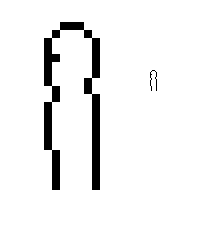
Okay, next step, the legs. Or, well, leg. Since you're drawing in profile, you only have to draw one!
[spoiler]
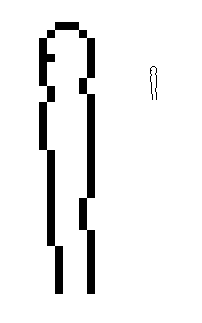
[/spoiler]
Notice the first offset along his back. This should be at about where his butt is, since most people's butts protrude slightly (and don't think I don't hear you giggling back there in the back row!).
Then, at about where his knee should be, I've put an offset in both lines. This is optional. I tend to do this, because straight vertical lines don't ever look as good in sprites as slightly-offset ones, but if your person is, say, standing at attention, their knees probably
should be locked in place.
To make legs bent, just as with a leaning torso, keep in mind the principle of angles as numbers. Make their upper leg one angle, their lower leg another angle, changing angle at the knee.
The length of the leg varies somewhat depending on who you're drawing, but the width is almost always around 4 pixels across (including the outline; 2 pixels across if you don't include the outline). Thinner than that usually looks too skinny, and thicker than that is probably going to look too fat.
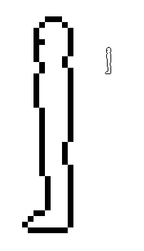
Next, the foot. Easy as pie.
[spoiler]
[/spoiler]
Just have a part that protrudes by two or three pixels, then a slanted part, then of course the flat part on the bottom. And, of course, the shape of the foot can vary by quite a bit, depending on the person's shoes, species, and foot size, so just play around with it until you get something you like.
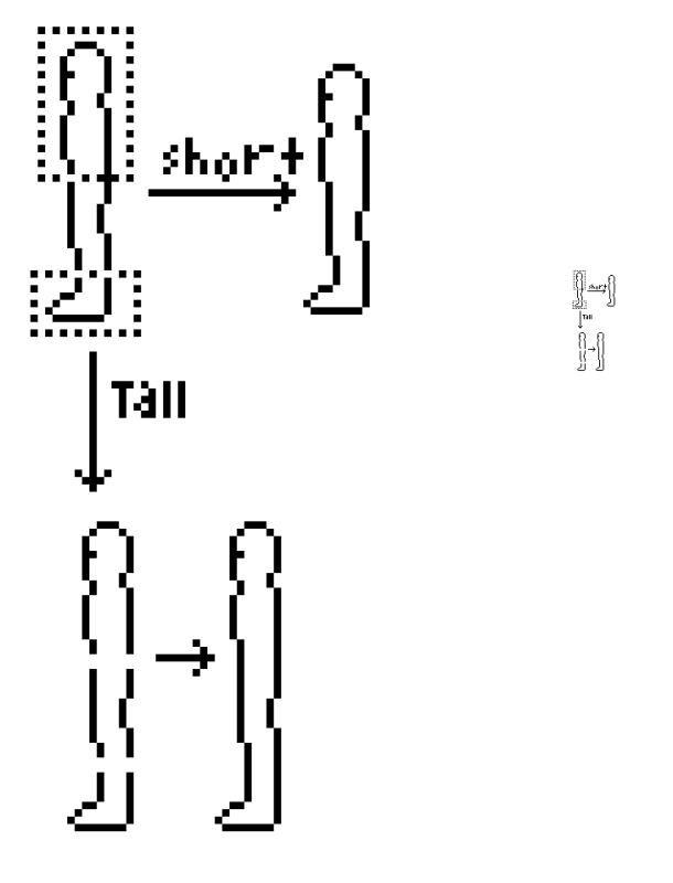
Okay, I mentioned earlier that I was going to explain how to change the size of things. In MS Paint, there is a little box tool in the top-right corner of your toolbox. That is the "drag" tool. You can use that to "highlight" any object you want to move from one place to another. Aside from the pencil, this is probably the tool I use more than any other.
Use it to highlight either the feet, or the head, of your person, like so:
[spoiler]
[/spoiler]
(You can't actually have two drag-boxes active at the same time, but I just drew it that way for simplicity's sake).
To make your guy shorter, move the head straight down, and then move the feet straight up. Or, if your body is at an angle, rather than moving straight up or straight down, just make sure you follow the angle of your lines.
To make your guy taller, move the head straight up, and the feet straight down. Then just use the pencil tool to re-draw the lines in the gaps left behind.
This method can actually be used to re-size lots of things. Just use the drag tool, and bisect the thing or part of the thing that you want to re-size, and "stretch" or "squish" it. You can re-size things horizontally or vertically, too.
A side note: the drag tool is also super-handy for changing angles. Just use it to drag part of your figure to the side, then fix any inconsistencies that causes, re-connect any broken lines, and presto!
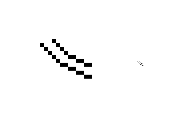
The next step is to draw the arm. I usually draw arms (and, for that matter, any limb that is not a direct continuation of the torso the way human legs are) separately from the body, and then re-attach them later.
A quick note: when drawing a creature with a tail, I treat the
tail as the continuation of the torso (instead of the leg), and so then I draw the legs separately and attach them later, as well.
Anyway, arms. The arm should not be much more than about 3 pixels across (including the outline), but, as with legs, length can vary.
I begin by drawing a "tube" of pixels, with a change in angle that denotes the elbow.
[spoiler]
[/spoiler]
The hand is basically just a vaguely hand-shaped blob. Don't try to draw individual fingers at this scale. It can't be done, and it will look ridiculous. Rather, just outline the very most basic shape of a hand. I can't really give directions on how to do so, because every hand I draw looks different from every other one. It all depends on what shape the hand is being held in, what angle it is seen at, and so forth. Just fiddle with it until it looks right to you.
[spoiler]
[/spoiler]
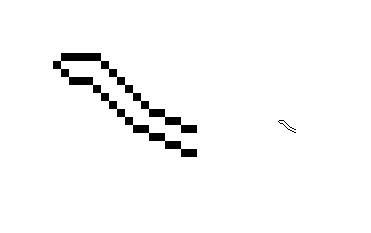
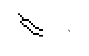
Here's an early attempt of mine. But then I realized that the arm was too long, the hand was too big, and the elbow wasn't noticeable enough. I added another pixel to the elbow to make it stick out a little more, and shortened the hand and arm. Oh, and I added a wand, because don't forget this is Ron I'm drawing.
[spoiler]
[/spoiler]
Next, you overlay the arm over the torso using the drag tool (making sure that your overlay settings are set to "transparent," which is the second option of the two options at the bottom of your toolbar. There should be two little pictures of colorful shapes, and you click the bottom one. And also make sure your "right-click color" is set to white):
[spoiler]
[/spoiler]
Then you erase the line where the outline of the torso shows through, and you wind up with this:
[spoiler]
[/spoiler]
Next step is hair. When drawing hair, forget everything you learned about curves. Hair is not about curves. Unless you have really, really, really long hair. Or perhaps an afro.
Even wavy hair can be depicted by alternating 2-pixel-blocks. And, most of the time when I'm drawing hair, I will have 1-pixel "bumps" protruding, just to show some roughness. Because hair should usually be a lot rougher than skin.
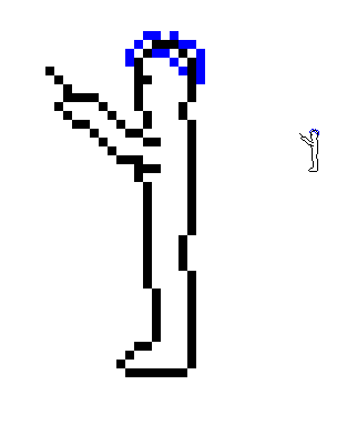
Anyway, draw the top of the hair and the hairline along the head around the outline of the top of the head. I've done this in blue:
[spoiler]
[/spoiler]
Every hairstyle is different, so once again, I can't really give you any hard-and-fast rules for drawing hair. Just play around with pixels until you get something that looks like the hair you're trying to draw. Use one-pixel bumps to make hair that "sticks up" and use alternating pixels to denote wavy hair (2-pixels for wavy, 1-pixel for spiky). Yeah, I think that's about all the advice I know how to give.
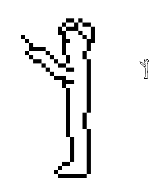
After you've drawn some hair, you take out the pixels (shown here in grey) where the hair covers up the outline of the head:
[spoiler]

[/spoiler]
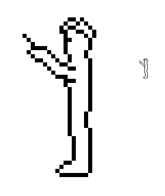
And you wind up with this:
[spoiler]
[/spoiler]
Most of the time, you won't get it quite right on your first go. I had to tweak Ron's hair a bit more after I thought I was "finished." And I finally got to this, which I was finally happy with:
[spoiler]
[/spoiler]
When "tweaking" hair, just keep in mind that you put in one pixel at a time, and take one out. This part will have you zooming in and out like crazy, but that's necessary if you're going to keep checking that your guy's hair looks okay at normal pixel size, and then to zoom back in to work on it some more if it doesn't.
Okay, last step. Clothes.
When drawing my Animorphs characters, in a way I had it easy because all their outfits are skin-tight. So all I had to do was outline the neck-line, pants-line, sleeve-lines, and cuff-lines, and that was their clothes.
For Ron, here, though, I wanted to show something a bit more complex. Wizards in Harry Potter wear robes, after all.
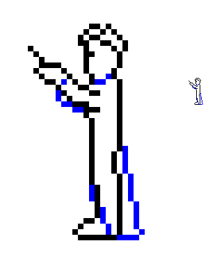
I've made an outline of Ron's robe in blue:
[spoiler]
[/spoiler]
Just a few pointers on loose-fitting clothes. Keep in mind how the clothes will hang around a person. Sleeves should 'fall' down a bit below the line of the arm in such cases. And cloaks usually curve slightly backwards to the ground, as I've shown.
[spoiler]
[/spoiler]
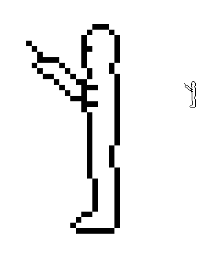
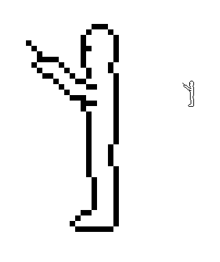
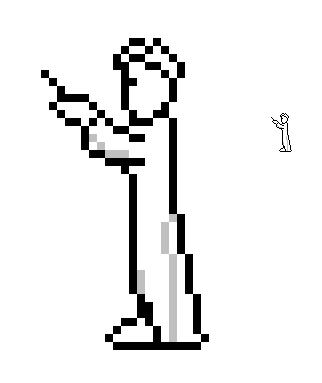
And then I erase the covered-up lines and:
[spoiler]
[/spoiler]
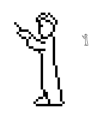
Ta-da! It's Ron!
Please note that there's a reason that I drew Ron's figure before drawing his clothes on him. And no, it wasn't so you all could gawk at a nude pixel-figure (and that's more than a little creepy if you actually think that it
was). It was because, if you don't do it that way, you could wind up with clothes that are smaller than the person underneath them is, or that hang wrong, or that defy basic rules of anatomy. You could very easily get something about your person's basic figure screwed up and never know it, and then not be able to fix it when you do notice it.
Our next lesson will cover how to shade Ron. If anyone else wants to jump the gun and go ahead and shade him, all of you already have the information needed to do so.
[spoiler]

[/spoiler]
Class dismissed!

